Mostrando entradas con la etiqueta Diseño. Mostrar todas las entradas
Mostrando entradas con la etiqueta Diseño. Mostrar todas las entradas
miércoles, 6 de julio de 2011
En Imágenes: Te presentamos 12 logotipos con exceso de referencia

Cuando vivimos en un mundo tan competitivo y globalizado, las empresas se esfuerzan constantemente en que su marca, producto o servicio, sobresalga sobre las demás. Sin embargo, muchas veces los "creativos" de las agencias sulen ser no tan creativos y se "inspiran" en otras marcas ya existentes para crear la identidad de la marca. Te presentamos 12 casos en los cuales los logotipos de algunas marcas tienen un exceso de "referencia o "inspiración" en otras ya existentes. Saquen ustedes sus propias conclusiones.


Nota: Los logotipos están ordenados sin criterio alguno, por lo que su posición no representa si fue o no "inspiración" del otro.
fuente; culturizando
22:38 0
martes, 28 de junio de 2011
Agregar valor mediante el diseño
Hace unos días hablábamos de la importancia de agregar valor a un producto como la única forma coherente de aumentar un precio dentro de una estrategia. Agregar valor no necesariamente implica rediseñar un producto… algunas veces puede basarse en publicidad, en el diseño mismo de éste o incluso de su empaque; aquí un buen ejemplo.
 Miller, la cerveza, está posicionada en Turquía como una marca ligada a eventos musicales; de hecho patrocina el Miller Music Factory y el Miller Freshtival.
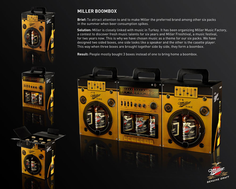 Miller, la cerveza, está posicionada en Turquía como una marca ligada a eventos musicales; de hecho patrocina el Miller Music Factory y el Miller Freshtival.
Con este marco, puedo casi imaginarme la instrucción detrás del brief: generar una forma de aumentar ventas y causar engagement con el consumidor.
¿Cómo se resolvió? De una manera sencillísima si la hablamos en retrospectiva, pero que definitivamente requirió mucho ingenio en el momento de su creación: convertir el empaque de six pack en un aparato de sonido.
El desarrollar un empaque de colección es una táctica socorrida, cierto, pero en esta ocasión hubo algo más… el usuario tenía que comprar tres empaques de seis cervezas para lograr armar el modular completo ¿Suficientemente bueno para incentivar ventas?
Indudablemente, en muchas ocasiones, agregar valor depende más de ser creativos que de gastar dinero.  Twittea esta frase.
Twittea esta frase.Como comentario adicional me hubiera gustado que el diseño de las bocinas, fueran altavoces reales; en México es común verlas como merchandising hecho de cartón reciclado. Hubiera sido la cereza en el pastel ¿No es así?
Advertising Agency: Manajans/JWT, Istanbul, Turkey
Creative Directors: Emine Noyan, Kaan Tanman
Copywriter: Cemre Tutar
Art Director: Orkun Yontem
Graphic Designer: Sinan Özçelik
3D Design: f/2.8 photograph studio
Creative Directors: Emine Noyan, Kaan Tanman
Copywriter: Cemre Tutar
Art Director: Orkun Yontem
Graphic Designer: Sinan Özçelik
3D Design: f/2.8 photograph studio
fuente: luismaram
11:55 0
sábado, 25 de junio de 2011
24 Logos con mensaje oculto
As nearly half of the year 2011 has eclipsed, I thought why not take a recap of some of the most marvelous creations in the logo design industry so far. Out of the many styles of designing a logo, the one that is everlasting is the concept of hidden logos. Being a logo designer, I have been an avid lover of logos with hidden messages. With several famous logos that incorporate a hidden meaning within the design, some of the most memorable that I can recall include the FedEx Logo, Baskin Robbins logo and Carrefour logo. But lately, there has been a massive increase in the trend of creating hidden logos by aspiring designers. Out of the many ways of creating hidden logos, one of the most popular is using negative space. Today, I have amassed a completely new and fresh collection of 24 inspirational logos that incorporate hidden messages in them. So come along and see if you can decipher them out. | |||||||||
|
| ||||||||
|
| ||||||||
|
| ||||||||
|
| ||||||||
|
| ||||||||
|
| ||||||||
|
| ||||||||
|
| ||||||||
|
| ||||||||
|
| ||||||||
|
| ||||||||
|
| ||||||||
fuente:logoblog | |||||||||


0:30 0
Suscribirse a:
Entradas (Atom)